

 Rapid Ext JS (beta)
 ReExt
ReExt


Enterprise-ready
UI framework to build modern web apps
Sencha Ext JS is a powerful JavaScript framework for creating data-rich, modern, cross-platform web and mobile applications. It enables rapid development of complex UIs using pre-built components, ensuring faster time to market.


 Front-end
 UI Components
 CMD
CMD Themer
 ReExt
ReExt Architect
 Test
Test Inspector
 UI/UX
UI/UX Fiddle
 Rapid Ext JS
 IDE Plugins
Loved by 200,000+ developers and trusted by 60% of fortune 100 companies

See how Real Capital Markets powers 50% of US commercial real estate sales using Ext JS.
Watch the video

Check out how Governance.io builds powerful governance and compliance app with Ext JS.
Watch the video


Learn how Icube automates transactions and improves operational efficiency with Ext JS

Discover how Canadian Blood Services transformed a complex UI system with Ext JS.
Watch the video
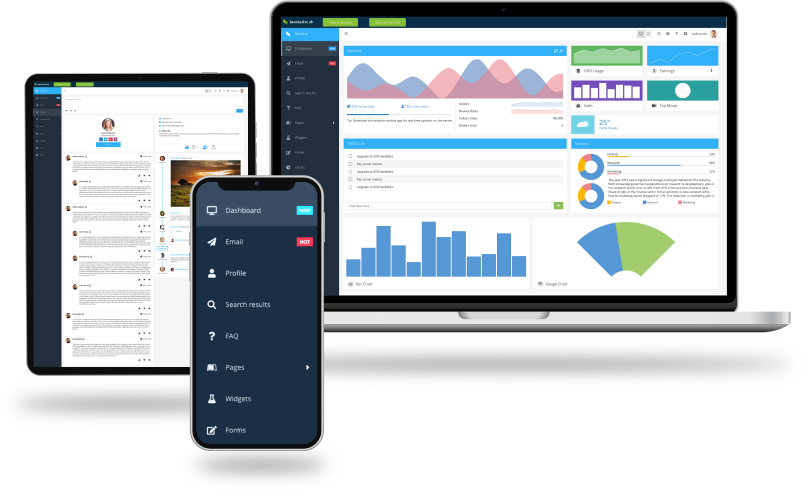
Everything you need to build robust web apps
Develop your modern business web apps seamlessly
Building a single-page enterprise web application involves many interconnected components. Ext JS comes with over 140 prebuilt UI components and tools you need to build a reliable, secure app with top-notch UI/UX and easy deployment.
Why develop with Sencha Ext JS?
Rich set of UI components
Ext JS is a powerful UI framework that includes 140+ preintegrated high-performance components. These components make it easy to develop fast and consistent UIs for large data sets and come with built-in themes for easy usability.
High productivity
Save 100+ hours on component creation and maintenance. Accelerate coding, debugging, testing, and deployment with our powerful IDE and editor plugins and our UI toolkit. Build high-quality cross-platform HTML5 apps today.
Faster time to market
Eliminate cross-browser and platform testing. Build and ship web apps faster with preintegrated tools—Themer, Fiddle, Inspector, Architect, and Sencha Test. Superior design at your fingertips.
Performant
Experience lightning-fast data processing, over 300x faster than other vendors. The object-oriented approach and support for MVC and MVVM ensure developers can use their existing skills to develop apps faster.
Secure framework
Safeguard mission-critical apps. Our proprietary UI framework ensures safety and integrity, eliminating risks of open-source solutions. Build amazing apps with robust and reliable user interfaces.
Platform & browser support
Tested across a wide range of browsers and platforms (web, mobile, desktop) and adaptable to different screen sizes, Ext JS delivers a professional and consistent look for exceptional user experiences.

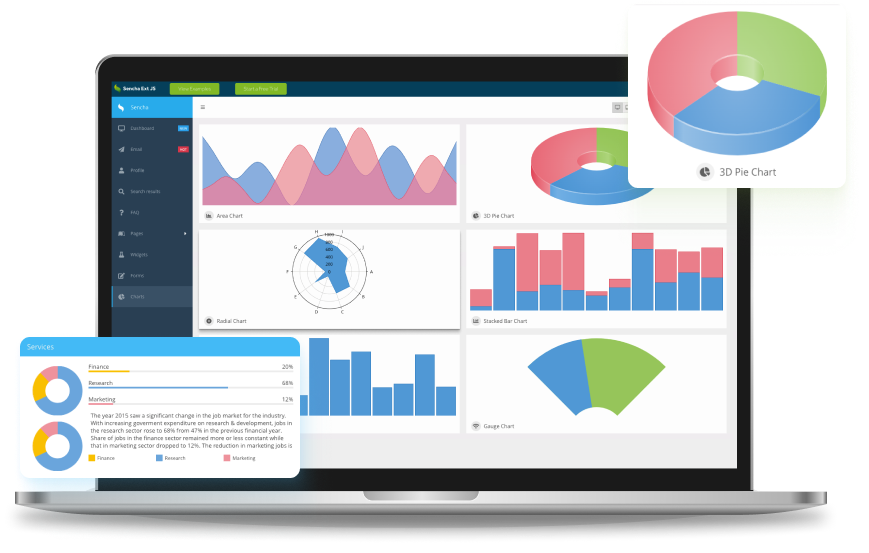
Explore the fully functional example application built entirely with EXT JS
Build a UI quickly and easily with few lines of code using Ext JS because everything is built in and you don’t have to rely on third-party libraries. It minimizes the need for HTML and CSS, allowing developers to focus on business logic and functionality.
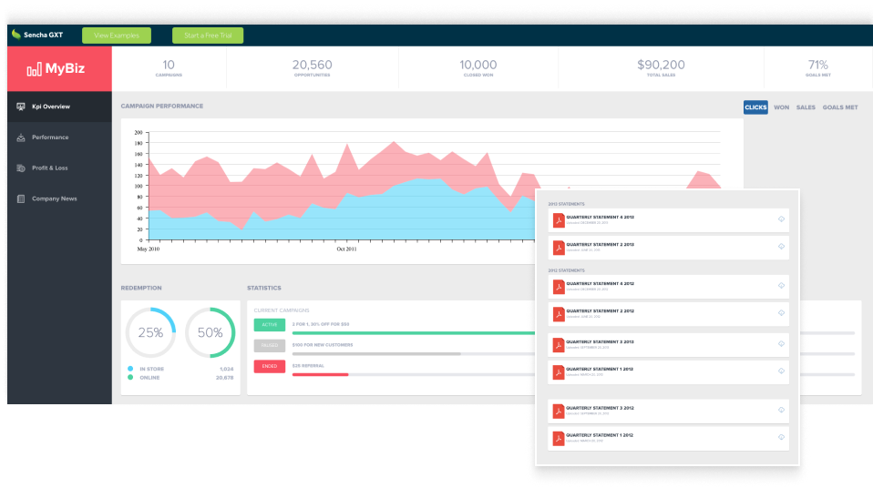
GXT: Your go-to web framework for Java development
Our comprehensive Java framework, Sencha GXT, empowers you to build feature-rich HTML5 applications using Java and GWT. With its adaptive layouts and highly optimized cross-platform HTML5 code, you can enjoy the flexibility and efficiency you deserve.
Ready to dive in?
Here’s how to get started building powerful apps with Sencha
Hassle-free licensing
Simple and straightforward licenses include no hidden fees, guaranteed. Visit our store to learn more about Sencha licensing, authorized resellers, and OEM licensing. Compare options and easily renew licenses.
Dedicated support
Enjoy truly unlimited dedicated support with our support portal, Sencha forum (knowledge base), Community, and Discord channel.